From Mood Board to Shopping List
Every guide to mood boards stops at inspiration. Here's the part nobody covers: turning a board full of images into things you can actually buy.
The short version
A mood board decides how a room should feel; it can't tell you what anything costs. To move from one to the other, replace each inspiration image with a specific product at a real price, keep the images you couldn't source as briefs rather than deleting them, and total the result before you buy anything.
There is no shortage of advice on making a mood board. Pick a room. Gather images. Group them so they mimic the layout. Step back and see what works together.
It’s good advice and it ends in exactly the same place every time: a beautiful board and no idea what any of it costs.
That gap is where most room projects stall. You know the feeling you want. You have forty images. And the next step, turning that into things with prices, dimensions and delivery dates, is a completely different kind of work that none of the mood board guides cover, because it isn’t really a design problem.
What a mood board is and isn’t for
A mood board answers one question well: does this go together? Colour, material, weight, era. It’s the cheapest possible way to find out that the brass and the black don’t work before you’ve bought either.
What it can’t answer:
- What does this cost?
- Does it fit?
- How long until it arrives?
- Which of these have I already bought?
- Am I over budget?
Those aren’t design questions, and a wall of images has no way to hold them. This is why so many people end up with a Pinterest board and a spreadsheet: two artefacts, describing the same project, that immediately start disagreeing.
The translation step
Moving from one to the other is a specific process, and it goes better if you treat it as one:
1. Sort the images into three piles. This exact thing (you know the product), this kind of thing (you like the shape but not a specific item), and this feeling (a whole room you like, not an object). Only the first pile is shoppable today.
2. Turn pile one into items with prices. For each, find the product page and record the price, the dimensions and the store. This is the moment the project becomes real, and it is usually where the first surprise lands.
3. Turn pile two into briefs. “Low, wide, pale wood, under $500, must clear the radiator.” A brief is far more useful than a saved image, because you can search against it and you can tell when you’ve found it.
4. Keep pile three as pile three. Don’t try to shop it. It’s the reference you check the finished room against.
5. Total pile one and see. Almost everyone is over at this point. That’s the information you were missing, and it’s much cheaper to have it now.
Don’t delete the ones you rule out
The most common mistake in this step is tidying. You find the sofa is $6,000, you take it off the board, and six weeks later you have no record of why you stopped looking at that shape.
Ruling something out is a decision worth keeping. Mark it, don’t delete it, and write the reason, because in two months “too expensive” and “wrong depth” lead to completely different searches.
The mood board’s job is finished the moment you stop adding to it and start pricing it. Keep it as a reference; don’t keep maintaining two lists.
What “visual” has to mean afterwards
The reason people are reluctant to leave the mood board is that the alternative has always been a spreadsheet, and a spreadsheet can’t show you whether the room hangs together. Rows of text about a rug tell you nothing about the rug.
So the requirement for whatever comes next is that it stays visual and holds data. Every item still shows as a picture, and every picture carries a price, a status, and whatever else the project needs. Lose the pictures and you can’t see the room. Lose the data and you’re back to a mood board.
Doing this in Vurra
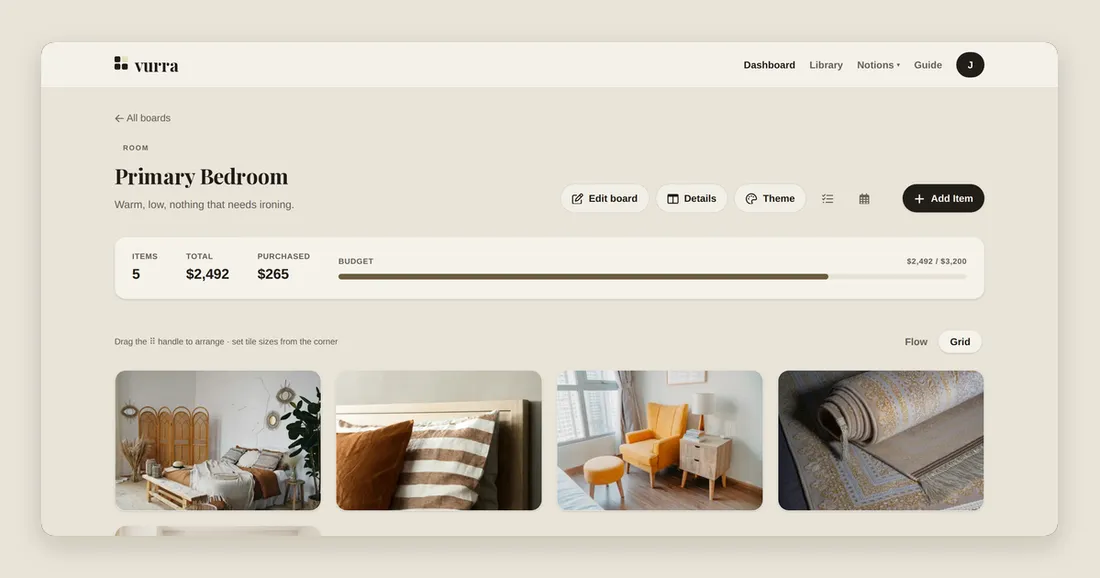
A board in Vurra is the mood board and the list at the same time, which is the whole point of it.
Add each item by pasting its product link: Vurra pulls the title, price and image off the page, so translating pile one is a paste per item rather than six fields. The board shows as tiles, so you can still see whether the palette works. Grid view leans further that way: a picture-led bento layout where the images do the talking and the numbers step back.
For pile two, add the item by hand with the brief in a field of your own
(Brief: low, wide, pale wood, clears the radiator) and no image. It sits on
the board as an open slot, visibly unfilled, which is a much better prompt than
a note somewhere else.
For pile three, a board typed as custom with no budget works fine as a pure
reference. Nothing forces a board to be a shopping list.
Set the budget and the board totals against it as you go, so step five happens continuously rather than as a nasty surprise. Statuses carry the ruling-out: mark something idea while it’s a maybe, and it stays visible without counting as a decision.